The Best Colors for a Warm Minimalist Home: Creating Calm Without Coldness
Beyond All-White Minimalism
There’s a particular kind of hesitation that many of us feel when it comes to color.
We want our homes to feel calm. Uncluttered. Easy to breathe in. And somewhere along the way, we absorbed the idea that the safest path to that feeling was white. Lots of white. Cool gray accents. Perhaps a black line here and there to add definition.
Clean. Minimal. Correct.
And yet — something feels off. The room is tidy, the surfaces are clear, and still it doesn’t feel restful. It feels more like a showroom than a sanctuary. Bright and flat and slightly exhausting, in a way you can’t quite put your finger on.
This is one of the most common quiet frustrations in minimalist home design: achieving the look without achieving the feeling.
The problem isn’t minimalism itself. It’s the color temperature of it.
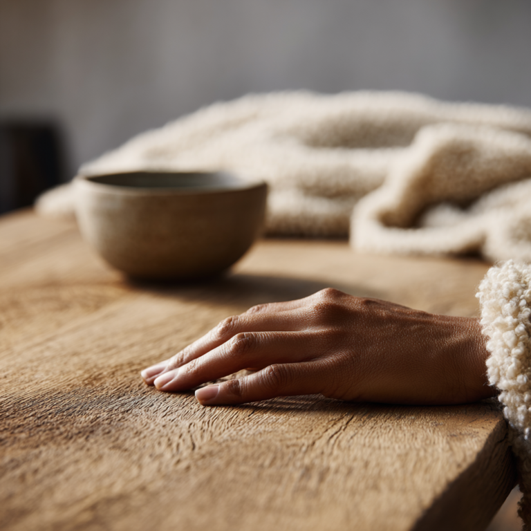
Stark white walls and cool-toned grays don’t actually relax the nervous system — they stimulate it. They bounce light around without absorbing it. They create visual brightness that reads as alertness, not ease. And when a room has no warmth in its palette, no soft depth, no color that reminds the body of earth and honey and hearthlight — it can feel clinical no matter how beautifully it’s arranged.
Warm minimalism offers a different path.
It uses color with great intention and great restraint — never splashing it around for excitement, but weaving it in quietly, purposefully, the way you’d add a generous pinch of something that changes the whole flavor of a dish.
The right colors don’t disrupt minimalist calm. They create it.
And in this fourth piece of our series — following Space, Texture, and Light — we finally arrive at color: the layer that brings everything home.
The Philosophy of Color in Warm Minimalism
In warm minimalism, color is not decoration. It is emotional support.
This is an important distinction. Decorative color is chosen to impress — to make a statement, to signal a personality, to catch the eye. Supportive color is chosen to feel something. To make a room feel safe, or grounding, or quietly alive. To make you exhale when you walk in.
Think about the difference between two minimalist rooms.
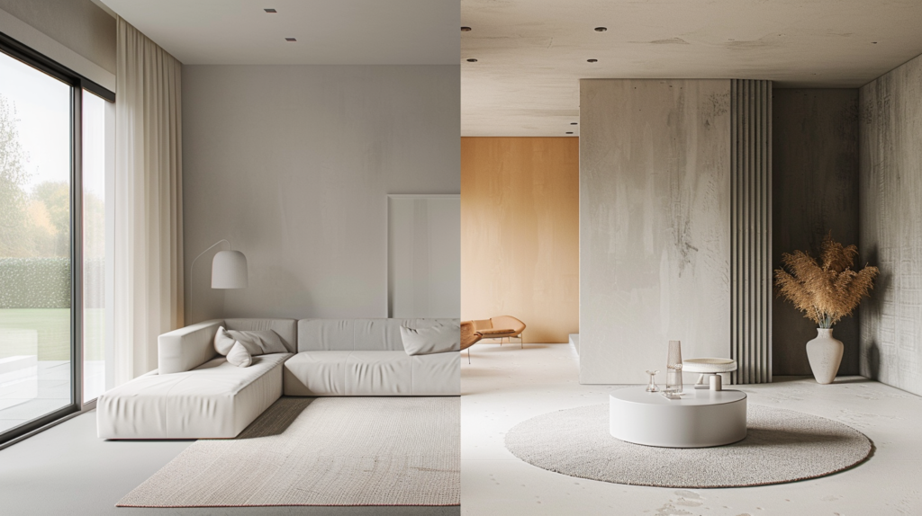
In the first: white walls, cool gray linen sofa, steel fixtures, glass surfaces. Everything is clean and deliberate. The room has restraint. But it also has a slight chill to it — not temperature, but emotional tone. The eye moves quickly around the room and finds nothing soft to rest on.
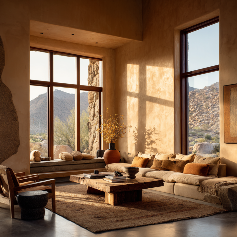
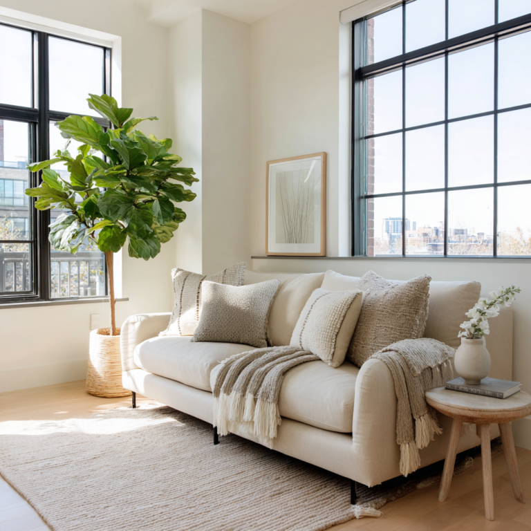
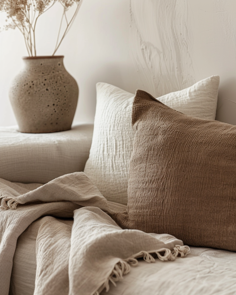
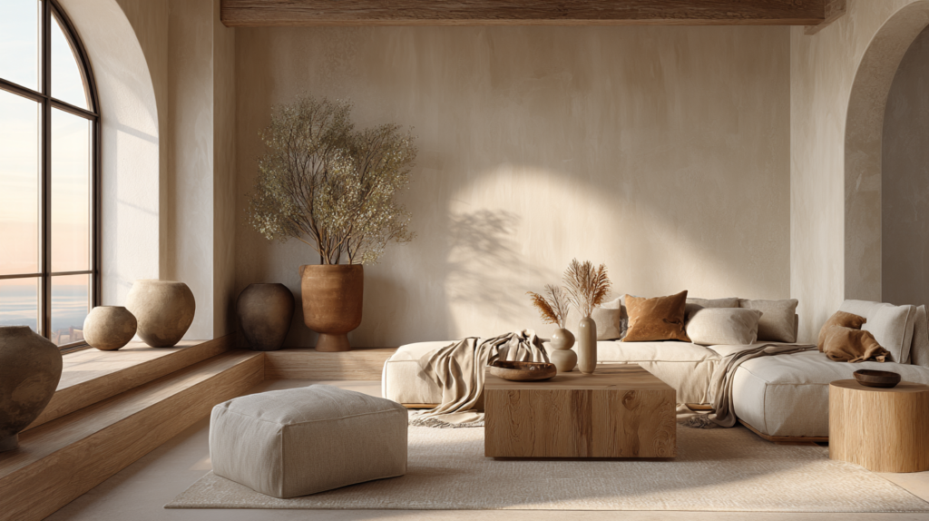
In the second: walls the color of warm oat milk, a sofa in a muted sand tone, a rough terracotta pot near the window, a woven throw in a soft caramel. Still minimal. Still uncluttered. But the body responds differently. There is something to settle into.
That is color doing its emotional work quietly and completely.
Cold minimalism reaches for bright whites, stark contrasts, and cool tones — silvers, blue-grays, icy linens. These colors suggest precision and modernity. They are often stunning in photographs and oddly enervating to live inside.
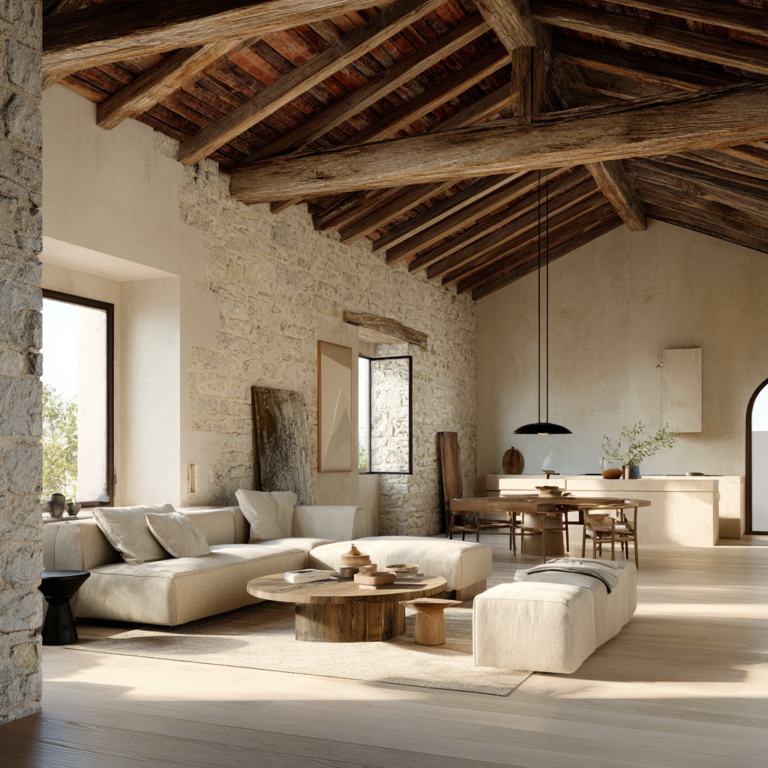
Warm minimalism, by contrast, reaches for hues that have some yellow or red in their undertone. Creamy, earthy, gentle. Colors that remind the subconscious of natural materials — clay, stone, sand, wood, dried grass, bark.
And color doesn’t work alone. As we’ve explored in this series, space gives a room room to breathe. Texture gives it something to feel. Light gives it life. Color is what ties these layers together, giving the room its emotional identity — its particular quality of warmth.
When color is chosen well, it becomes invisible in the best possible sense. You stop noticing it. You just feel good in the room.
The Warm Minimalist Color Palette
Let’s talk about the actual colors — the ones that, used with intention, transform a home from sterile to soulful.
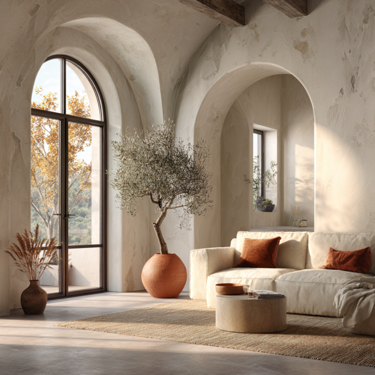
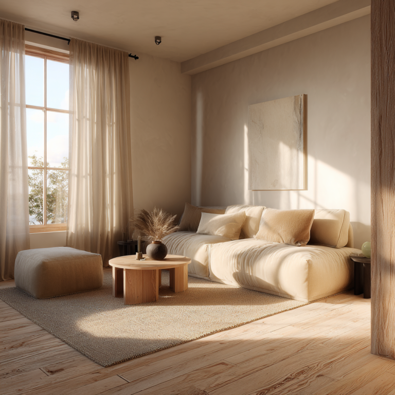
Creamy whites and oat milks. If white is in your palette, let it be warm white. The color of fresh cream, of unbleached linen, of morning fog with a little gold in it. These whites have just enough yellow or pink undertone to feel soft and human, rather than the blue-white brightness of printer paper. On a wall, a creamy white reads as light and airy — but gently so, like filtered sunlight rather than a spotlight.
Warm taupes and greiges. Taupe — that sophisticated blend of gray and brown — is one of the hardest colors to get wrong in a warm minimalist home. Choose versions that lean toward brown rather than lavender or cool gray, and you have a wall color that feels like dusk: calm, dimensional, deeply comfortable. Greige (gray-beige) occupies similar territory — neutral enough to recede, warm enough to embrace.
Soft beiges and caramels. Beige has suffered an unfair reputation for blandness, largely because it was used so uniformly in the 1990s. But a good warm beige — especially in natural light — is one of the loveliest things a wall can do. And caramel, introduced through furniture or textiles, adds a richness that feels grounded and generous.
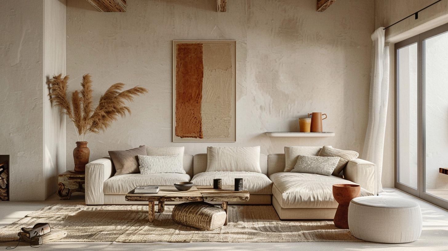
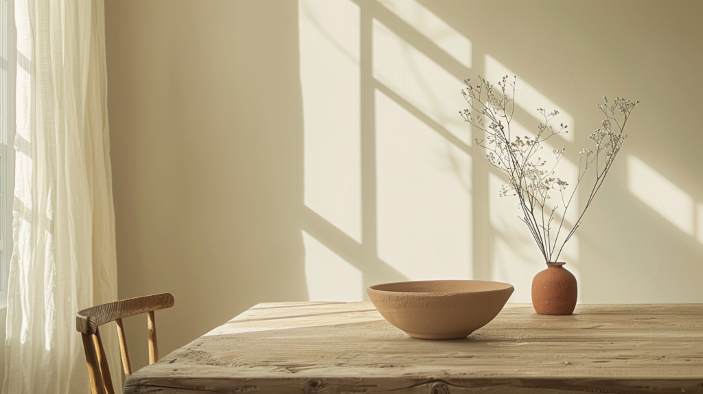
Gentle terracotta and warm clay. These are the colors that have returned to our collective consciousness in recent years, and for good reason. Terracotta is joyful without being loud. It carries the warmth of sun-baked earth, of handmade pottery, of the Mediterranean afternoon. Used on a single wall or introduced through objects, it brings a room to life instantly — without overwhelming it.
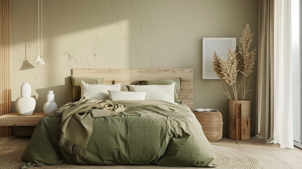
Muted sage, olive, and earthy greens. Greens in warm minimalism are always muted — desaturated enough to read as neutral but alive with the presence of nature. Sage feels spa-like and restoring. Olive brings richness and a slight antiquity. Earthy moss tones feel forest-grounded. These greens are beautiful on walls, in textiles, in plants, in glazed ceramics.
Warm blacks and deep charcoals. In small doses, a deep warm black — one with brown or green undertones rather than blue — is a grounding force in a warm palette. A single dark accent, whether a lamp base, a picture frame, or a painted alcove, creates the visual anchor that lets all the softer tones float peacefully around it.
What all these colors share is this: they absorb light rather than deflecting it, and they carry within them the memory of natural materials. The nervous system recognizes them as safe and familiar. In their presence, we instinctively slow down.
That is not an accident. That is color doing exactly what it was meant to do.
How to Use Color Successfully in Warm Minimalism
Knowing which colors to choose is only half the conversation. The other half is understanding how to use them — with the kind of restraint and intention that keeps a space feeling calm rather than chaotic.
A gentle framework that works beautifully in warm minimalist interiors is a variation of the classic 60-30-10 rule: roughly 60% of a room in a dominant tone, 30% in a secondary tone, and 10% in an accent.
In practice, this might look like: creamy oat walls (60%), a warm greige sofa and natural wood floor (30%), and small touches of terracotta or muted olive through cushions, a single ceramic vase, a woven basket (10%). The result feels complete but never crowded. Layered but never busy.
One of the most effective techniques in warm minimalism is tonal dressing — layering similar hues at different depths. Rather than introducing contrast, you deepen. Imagine a room where the wall is warm sand, the sofa is a tone deeper in the same family, the rug is darker still, and the throw is back to a lighter hue. The eye moves easily around this room. Nothing shouts. Everything coheres.
It’s also worth remembering that color doesn’t only live in paint. In fact, some of the most impactful color in a warm minimalist home comes through materials: the amber warmth of a honey-toned wooden floor, the soft terracotta of an unglazed pot, the sage of a linen throw. Using color this way means it arrives with texture built in — two layers for the price of one.
And don’t forget what we explored in our piece on light: the same color reads entirely differently at 8am, at noon, and at 7pm. A warm taupe wall may look almost white in bright morning light and a rich, enveloping cocoa by lamplight in the evening. Testing a color at different times of day, in your specific space, with your specific light — this is essential.
Which brings us to a gentle question worth sitting with: What feeling do you most want to come home to? The answer to that question is, more often than not, a color.
Common Color Mistakes and Gentle Corrections
If your home doesn’t feel as warm as you’d like, one of a few things is likely happening — and each one has a simple, encouraging fix.
Using cool grays as your neutral. Cool gray became enormously fashionable and equally enormous in scale — it covered millions of walls for years. The problem is that cool gray has blue or purple undertones, and those undertones read as cold, especially in northern light or on cloudy days. The fix: look for warm greige or taupe alternatives, or test a warm gray that has more brown than blue in its base.
Bright or blue-white walls that repel warmth. Brilliant whites amplify natural light beautifully in a studio photography setting. In a home, they can feel unforgiving and fatiguing. Swap for a warm white with a yellow or pink undertone — Dulux, Farrow & Ball, and Benjamin Moore all offer beautiful versions — and notice how the room begins to feel more like a home.
Too many competing colors, even if each one is beautiful. Warm minimalism doesn’t mean a monotone room, but it does mean a cohesive room. If every surface is a different warm hue — terracotta wall, caramel sofa, olive cushions, warm pink rug — the eye doesn’t know where to rest. Choose one or two colors as anchors, and let the rest be tonal variations on those themes.
Ignoring the undertones. Two beiges that look nearly identical on a chip can clash dramatically on a wall when their undertones fight. One reads pink, one reads green, and suddenly the room feels vaguely off without anyone being able to say why. When building a palette, always check undertones, and test large swatches before committing.
These aren’t failures — they’re learnings. Every one of them leads toward something better.
Building Your Personal Warm Minimalist Palette
Here’s the most important thing to remember: there is no single correct warm minimalist palette. There is only the one that feels right in your home, with your light, for your nervous system.
To find it, start with a few gentle questions.
What colors do you naturally reach for in clothing when you want to feel at ease? The colors that comfort us in what we wear often comfort us in where we live. What natural environments make you feel most peaceful? Desert warmth, forest green, coastal stone — these landscapes carry colors that your body already knows and trusts.
Then, test before you commit. Paint large swatches — at least A3 size — directly on the wall, in multiple spots. Live with them for several days. Look at them in morning light and evening lamplight. Notice how they feel when you walk past them, not just when you stand and study them.
For seasonal flexibility, think of your walls as the constant and your textiles as the variable. A warm oat wall reads beautifully with linen in cream and white in summer, and with deeper caramels, rust tones, and warm charcoal in autumn and winter. The bones of the palette stay the same; the mood shifts gently with the season.
This is intentional living in its most tactile form — the practice of shaping your environment to reflect and support who you are and what you need.
A Home That Feels Like You
We have now layered all four elements of warm minimalism together.
Space gives your home room to breathe. Texture gives it something to feel. Light brings it alive and anchors you to the rhythm of the day. And color — quiet, intentional, soulful color — gives it emotional identity. It makes the room yours.
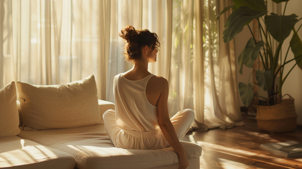
When these four things align, something simple and profound happens: you stop walking through your home and start inhabiting it. It begins to feel less like a designed environment and more like an extension of yourself.
This week, try just one thing. Pick up a sample pot of a warm white, a soft taupe, or a muted sage. Paint a large swatch somewhere you pass often. Live with it for a few days. Notice what you feel.
Color doesn’t have to be a commitment. It can begin as a small, curious experiment — a gentle conversation between you and your space about what warmth really means to you.
Your home is waiting for that conversation. And it already knows the answer.
If this piece stirred something in you, I’d gently invite you to try one small color experiment this week — a sample pot, a new throw, a terracotta pot on a windowsill. Share what shifts. Sometimes the most meaningful changes begin with a single, quiet swatch of warmth.
Join the Circle of Warmth
A quiet letter on warm, intentional living — delivered occasionally.